Tuesday, 31 January 2012

Assessment of first shoots


Weaknesses:
The camerawork wasn't very stable as the tripod was slightly broken. Therefore the shots were slightly wobbly. 
The clip was quite jumpy and there wasn't good continuity when the couple were walking down the stairs to the cupboard, it doesn't flow how we wanted it to. It needed an extra shot inbetween coming from the stairs to cupboard. 
The clip wasn't very scary probably because it wasn't fully edited and the lighting didn't make the film look very scary or easily show that it was a psychological horror. We also had no action/reaction shots, reverse shots to show the characters emotion. The colours were too bright and didn't create stereotypical psychological horror look. 

Strengths:
The characters and settings were believable, the house had been made to look like it had just been moved into. The props for example, the book, looked realistic.
The acting was appropriate and made sense, the dialogue was clear and the actors understood what they were they were meant to be doing. 
The composition of the shots worked well throughout the film. There was a variety of shot types and angles that quickened the pace of the film. The house is empty and is supposed to create an atmosphere of emptiness and vulnerability. 


Evaluation Question 4

The audience that we have targeted our film at would be young people, more likely female because this is the highest social group that watch psychological horrors in the cinema. Furthermore, the character with the most screen time is a white young women, she witnesses the most of the threats and therefore the audience are more likely  to relate to her or put themselves in her position. The rating for this film should be a 15 because it doesn't contain themes strong enough to earn an 18 certificate.

Monday, 30 January 2012

Evaluation Question 2

I chose this actor to play the part of the older male, as he seemed right for the part. He has a facial hair which gives the connotations that hes more mature, hes also slim, white and westernised as are the other young couples from the films from my subgenre.
This actress is in her twenties so she fits the part as being in a  young couple, she's blonde which could suggest innocence. Shes also slim white and westernised like her onscreen boyfriend, so they represent everything that other films like Paranomal Activity do because the main characters fit into the same catagories.


The narrative of our film is a young couple just moving into a new house, they later realise that somethings wrong. There seems to be strange behaviour in the neightbour hood, and weird happening from inside the house too. This fits with the conventions of modern psychological horror films as most of them seem to be young couples being haunted because of their house of their family.

However, due to our inabiltiy to film with the original cast, the main characters needed changing. Instead of having a young couple, we used a young girl on her own which shows how much more vunerable she is. She wears a white shirt in the film to symbolise her innocence. Because shes on her own, the audience may feel more frightened for her, as she is unpretected from the threat that's haunting her.

Evaluation Question 2


http://www.youtube.com/watch?v=_x7YNJdB1uk

This trailer of The Others represents middle class families in world war II. The mother has been left to run the house and take care of the children whilst the father is at war, and theres not promise of his returning. She also represents religous groups, as she has strong beliefs from the Bible. Shes also fits in with the stereotype of being a woman, shes unprotected from the threat in a big house.

Evaluation Question 2


http://www.youtube.com/watch?v=f7UUtLZ1Sgw&feature=player_embedded

The mother in this clip of Insidious is conforming with the social stereotypes of being a woman. She appeares to be staying at home in the day time and doing domestic chores. By being home alone she is vunerable to the threat as she is seen as a weaker than a group of men for example. She's representing young western families of today aged in her twenties, this doesnt really challenge any stereotypes in the media.

Tuesday, 24 January 2012

Reflective Evaulation

These images below show how our film has used, developed and challenged forms and conventions of existing media products.


This logo follows the stereotypical features of a psychological horror such as the main colour used is red which tends to represent blood in horrors and evil. Black is also used because horrors are dark and mysterious, the font used looks quite traditional almost but the ends of the letters are slightly split and twisted to probably represent evil and horror. The title is very large on the screen to almost jump out at you, the text is also written in capitals to maybe suggest realism and seriousness.


This is our logo for our film, it follows stereotypical features of quite a scary dripping horror look. It is not that similar to the Insidious title though. However it still gives off the same obvious message that the film is a horror, it still uses dark colours and quite striking text. The text here is also in capitals to suggest realism and seriousness of the film.


These titles are from 'Sixth Sense' and follow a very stereotypical psychological horror sequence, the text is again in capitals and there is also an old monochrome background of a city. There is also a black vignette around the video to create the mystery and a slight sense of the unknown. The font used is quite crooked and slightly odd looking, the text is also in white to match the black and white theme of the sequence.


 These are the titles for our film which follow stereotypical horror conventions as the text is capitalised and quite different looking. The visuals are also an old book that is being blown about in the wind which follows stereotypical psychological horrors which usually show strange objects in strange locations.


This picture is of a character out of Insidious and this image instantly shows that the film is a psychological horror, this is because firstly you can notice the lighting is used from below and creates deep shadows on the face to show possible stress or worry on the character possibly because of surroundings. Secondly the woman looks quite serious and almost as if she is looking at something evil. The woman is also dressed as far as we can see in normal clothes which is the stereotypical costume of a psychological horror for the victims.

Here in our film you can see straightaway this film is a horror due to the lighting causing dark shadows on the characters face showing clear scared and worried emotion. This character also looks like she has possibly seen or is about to find something quite evil and scary. She is dressed quite normally as most victims are in psychological horrors. 


This image clearly shows that the character shown is an evil character, this is shown by the use of pale white make-up and dark around the eyes. The use of costume also shows that this character is an evil woman as it is wearing a dress with a weird veil covering the characters face. The candle the character is holding also creates dark shadows on the characters face creating an evil look. This is not always the stereotypical look for a psychological horror enemy. But it does relate to some psychological demons and ghosts.

In our film we didn't actually show a clear shot of our threat or evil character as it was more psychological within the house and not necessarily visible. Our main threat was inside the cupboard where strange noises and sounds were coming from. You could tell this was evil due to the sound editing we added and the tension built up to opening the cupboard.


This image is a perfect example of stereotypical mise en scene for a psychological horror film containing demons. As you can see there is very dark and moody lighting in the room creating dark corners and mysterious shapes. The room is a stereotypical boy's bedroom which would be considered very normal as stereotypically in psychological horrors the victim's lives are normal until the plot unfolds. There is almost a strange demon shaped figure in the corner reaching out for the boy which gives a great sense of danger to the scene. There is also hospital equipment being used as props to show possibly pain and unease, this makes the audience believe there is something already not so right about the boy in the bed.


Here is a good example of mise en scene as This shows the audience that this film is about moving into a house that's being haunted, which is a typical theme from psychological horrors of today.The rule of thirds is also used here as the threat is in the thirds line showing the audience that this character walking past is significant to the movie. 


 I chose this key image because I believe it shows the stereotypical couple from many psychological horror films, as you can see the woman looks very worried from her facial expression and the man is seen to be trying to keep the woman calm with a slightly worried look himself. The costumes used are very casual normal clothes as are the couple. This is seen to be very common in modern psychological horrors as the victims are seen to be normal people to show things can happen to anyone.


This key image shows the main victim from our film, we were originally going to use a couple in our film but we had to make changes due to not being able to get the right actors. But a young female is very stereotypical of psychological horrors as they are commonly chosen to play as the victims in many of todays horrors. Here she looks very vulnerable and alone with a slightly confused and worried look.


 I chose this key image as I believe it is very shocking image from the psychological horror 'Insidious' and shows the evil happening to the normal everyday family. As you can see the bed sheets have been torn and stained with blood in the shapes of hand prints. The boy on the floor looks like the main victim here and is unconscious on the floor while his parents are trying to make sure he is okay. This is a very stereotypical situation in a psychological horror containing a family as the most vulnerable (the youngest) is usually targeted as the audience normally care more for children.

This key image from our film shows our character about to be shocked by what she sees in the cupboard. This a good jump scare yet the audience don't actually see what is in the cupboard which keeps the audience thinking of what could be in there. They have to presume the worst by the emotion that is about to be shown on the victim's face.


 This shot is very important i think as it shows the very normal looking father from insidious being almost mocked by as we can see the evil character in the story. The make-up used on the demon is very striking colours; red and black. Which are usaully represented as evil colours for example red can mean blood and black is dark and mysterious, the unknown. This shot is very striking and is used to shock the audience in the film with a slight jump-scare. Which is a very common way to scare the audience in psychological horrors.
I think this shot is a key image as it shows the victim being teased or mocked by the threat by it walking past the window and making the victim go to the window yet not seeing anything or anyone. This is very common in many modern day psychological horrors as the main threats tend to lead the victims onto places or do things they may not want to.


I chose this image as a key image as I believe it is a very stereotypical view on psychological horrors, the mother is standing in the dark room shocked by what must be something evil that the mother did not expect. The lighting used in this creates quite a mysterious feeling and a sense of the unknown. The camera is mainly focused on her to show the audience that she is very important in this shot and should be noticed to show the audience that something bad has happened. There is also a man holding technical equipment in the background to make the shot even more mysterious and for the audience to think 'what is going on?' this is a good use of props and backing up the ideology of modern psychological horrors.


I chose this image because like above I believe this is a very important part of our film and very stereotypical in psychological horrrors. The victim has just opened the cupboard and has almost a shocked expression because the victims face is almost blank in shock. The lighting causes a very dark feel to the shot and gives off the impression something very evil is inside the cupboard. This makes the audience think and try to guess what horrible thing could of been inside. 

Evaluation


1) This image develops existing conventions from my sub genre as the writing has been made to look like that of a child therefore giving the viewer the idea that a child character may very well feature in this film. Also the fact that there is something blocking the 'source of light' indicates to the viewer that there may be some sort of possessive 'bad guy' in this film or something that has the power to take over someone.
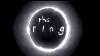
This image develops existing conventions by using the writing like it apart of the tape. The style of writing is the same as the title but it is fuzzier like an old recording. It's to show the tape is going to be a big importance in the movie and making the audience wanting to know what the tape is. As this tape is so important it could make people feel intimidated.


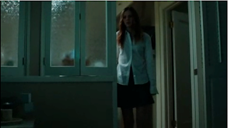
This image is showing the character scared and worried about what is happening in her surroundings which is showing the tape is in control in a way. Making the audience feel scared about the situation the character is in. She knows something bad is going to happen to her because she has seen the tape, and she feels intimidated because she knows she is going to die.


This picture is showing the Mise-en-Scene with the two main characters viewing the tape and learn what it does. This develops existing conventions by showing the main characters going deeper in the situation, learning about the problems that have been happening and what the tape is all about. Also they are in a place surrounded by cameras and tapes which is showing that the man knows what he is doing. It is also showing the character look a bit scared because they know what can happen.


2) In Insidious the victim is  a young boy who is being haunted by ghosts which he created by his thoughts. This is because he hit his head and went into a deep coma which causes these thoughts to get self control, and starts haunting the boy because they want him. It challenges stereotypes as no one would think that a young boy in a coma would be able to do that with his thoughts.


The trailer for The sixth sense is showing this boy who can see dead people, and this doctor who is trying to cure this. The boy is helping the ghosts to solve their problems and to stop them wondering the earth. This i showing bravery of the doctor and the young boy which are going to any lengths to solve the problem.


REC.jpg
3) 


4) The audience that we have picked our film are young people, more females because this is the highest social group that watch more psychological horrors in the cinema. The character with the most screen time is a white young women, she witnesses the most of the threats and therefore the audience are more likely to compare themselves to her. The rating for this film should be 15 because it doesn't contain strong themes to have a 18 certificate.

5)

Tuesday, 17 January 2012

Question 1


This  follows the normal conventions of a psychological horror, the logo of the film - which is the title - is distorted and pixeled which may symbolize visual or mental unclearness. The rest of the words on this photo like 'wrath' and 'envy' are powerful emotions that could cause a lot of emotional upset. The background of this picture seems to be rusted and dirty, showing that the surface has been ruined.  All elements to this photo comply with the conventions of the sub-genre.

 This is the production  logo for our film, its similar to the Seven films logo, as it has the dirty brown feel in the font. Also within the writing is a hand print and smudged writing, this symbolises unclearness and maybe desperation.


This image taken from the opening titles of the film show deformed fingers, it implies to the  audience that something isn't normal from the start. Broken fingers give the impression of physical violence, possibly self inflicted. The dark showing in the right corner shows that the person doing this is hidden, which creates a sense of mystery and unknowing. Furthermore, the text that the titles are displayed in looks handwritten and messy, it could make the audience feel like it's more
personal, its been directly wrote from the culprit.


This shot from the title sequence shows an old book, discarded and its pages flapping in the wind. This may cause a question as to why its been thrown out. Also this is been taken from a low angle, suggesting to the audience that this book holds power and dominance which maybe unsettling.


We can see here that our main character is slightly oblivious to the threats happening around her. She's hasn't noticed that there's a dark figure stalking her from the outside. Her top is white, which symbolises innocence and venerability in this house alone. Her facial expression shows her to be shocked and frightened.


The character in this image is holding his head, which implies that he's stressed, confused or  maybe worried. It puts across the idea of a psychological horror, that the threat is something that plays games with your mind.


At this point in the film looks unsure and confused  after hearing a threat.  This is sticking with the conventions of a psychological horror film, as its her distressed disposition that signifies her role in this sub-genre of horror film.


This shot is to represent the Mise-en-scene in the film, it shows photograph of a woman been vandalized in a threatening way. The circles round her eyes representing the blood in which is likely to be the death of that character. The is important as the audience aren't aware of who has done it, which is likely to add to the confusion of a psychological horror.


The narrative is easy to comprehend from this shot. It shows the main character unpacking a box because she has recently moved in, and it shows the threat in the background. This shows the audience that this film is about moving into a house thats being haunted, which is a typical theme from psychological horrors of today.


This image represents the victims from the film Seven and how they have been killed by their sins. This particular characters sin appears to be gluttony, and his death looks to be related to his sin. This is how all of the victims from the film die so its a good representation of characters.


This shot shows the character conforming to the conventions of a horror film. Although she's venerable and alone, she still goes towards the threat instead of protecting herself. I thought when making the film it was important to conform to this convention because its something an audience would look for and enjoy.


The first key image from the film is the murder scene of 'Sloth', this shows the audience that the serial killer has put the victim through a year of pain and suffering, it shows how mentally unstable and merciless he is. The sin of the victim wrote on the wall which looks to be in blood and the same font as the title sequence. This seems to be recurring in most of the  murders.  photo doesnt show the image of the dead body, but whats has been left behind by the killer. This is mainly blood stained white carpet leaves a memorable image in the audiences minds.

I thought this shot was important as it shows that in the beginning, the main character has power and authority. She has the keys to her house and she enters without feeling threatened or frightened. In contrast to later on in the film, when she starts to hear noises and see strange things which make her panic.


This photo doesn't show the image of the dead body, but whats has been left behind by the killer. This is mainly blood stained white carpet leaves a memorable image in the audiences minds. The character in this shot looks confused and anxious, the way a character from a psychological horror is expected to feel here.


The main character in this shot looks alone, and isolated. This represents possibly how unable she is to look after herself. Because she's so alone, the audience may feel sympathy for her. This is why i thought this shot was important.

This image follows the conventions of the film by having the sin written in blood on a white surface. The victim in this photo is wearing white and lying in a white bed, this symbolyses innocence and vulnerability. The colour symbolism of having red blood on a white sheet would be an image that should stick the audiences mind.


 Taken from the title sequence, we see something that usually associated with happy and harmless things (the doll) as chucked out and becoming ruined. The plant and mud are covering it, showing that the most innocent things can turn dirty and ruined.


Scary Doll Music

This piece of music is in relation to children's toys which features in our title sequence. This will link in well together so our piece of music will be similar to this.

When we're filming and what we'll need

We will be starting to film the title sequence on the 25th of January, the cast may not be available to film on this day because of other commitments.
Filming our opening scene will be on a different day that all the cast are able to film this will probably be the 29th.
The things that we will need to include and take with us to film consist of:
Camera & Tripod
Props for title sequence (pot doll and burnt book)
Smoke machine
Light on a stand

Wednesday, 11 January 2012

Shot List

This is the shot list for the main footage. (Not title sequence)

Ben Bushell Previous Student Work Assessment


Strengths:
I think that the strengths in this film were that it was recognised as a horror film easily and it has a good range of shots like mid shots, close ups and long shots. It also flows really well as the story makes sense, Sound is used well to create fear by using an eerie piano song in the background.

Weaknesses:
I think the weaknesses were that the film seemed to cut off at the end by just saying 2 weeks before abduction and that's it. It seemed unfinished.

Mark: 55/60


Strengths:
The main strength in this film was the Mise en Scene, the visuals were great and the location was really good. There was also a good use of shots and camera angles, the story was flowed quite well and continuity was good. It was easily recognisable as a horror from the creepy title sequence.

Weaknesses:
Some weaknesses were that sound wasn't used enough to create fear in the film and framing could of been a little bit better as there isn't much use of the rule of thirds when it was possible.


Mark: 45/60

Paige Smith Marking Previous Student Work


Weaknesses
The films weaknesses were mainly that the sound effects weren't used very well for example when the girl was being cut up it seemed really fake and the Mise en Scene wasn't too great for that part.

Strengths
The Strengths in this clip were that it was a typical horror film so it was easily recognized and it had a good flow of continuity. The music was used well to create fear throughout and the framing was taken into good consideration.

Mark: 48/60


Weaknesses:
This film didn't have many weaknesses, the only main weakness was that it seemed slightly strange there already being a ladder into the dark loft laid out.

Strengths
This film has many strengths such as how easily it is to tell that it's a horror film and it is really well framed as the rule of thirds is used in many shots. Mise en Scene is really good as there is many visuals that keep the film interesting throughout and the sound created fear instantly as screeching violins and spooky voices ran throughout the film.

Mark: 53/60

Kyle Nequest - Previous Student Work Assessment

Strengths:
It has a good range of shots and the sound has been used well to create a lot of fear by using unusual bass sounds and screeches to make the viewer seem nervous and slightly paranoid as to what's going to happen. It flows quite well as the story seems to make good sense.

Weaknesses:
The film doesn't exactly look like a horror film straightaway without obviously knowing that it is one, it's only about half way through it becomes recognizable as a horror film. Framing wasn't taken into a lot of consideration as the rule of thirds could of been followed much better on some shots yet they weren't.

Mark: 44/60


http://www.youtube.com/watch?v=xkPrQahGSds&list=PL72143FB46C11715F&index=29&feature=plpp_video

Strengths:
This films strengths were the way sound was used to create fear such as the creepy childrens song that plays twice in the clip and the banging sounds. This film is instantly identifiable as a horror because of the sudden start of a girl screaming.

Weaknesses:
This film has many weaknesses such as the really bad flow of continuity, it's really hard to understand what is going on in the film as the end of the clip seems to just be a replay of the start. Framing wasn't really took into consideration with the odd decent shot with okay framing, Mise en Scene wasn't that good as the visuals weren't very interesting and seemed very bland. The clip doesn't have a big range of shots as it's mainly just Mid shots and close ups from eye level with the occasional high angle.

Mark: 29/60

Tuesday, 10 January 2012

Shot list for title sequence

Here is the shot list for our title sequence. 

Target Audience Research

Looking at results from the IMDB website I have gathered information and statistical facts about the type of audience we need to target, this includes age, gender and race. 

True Blood Title Sequence

The true blood title sequence uses theme to create a title sequence by using relevant visuals to the sub-genre. Such as when there's a sign outside a church saying 'God Hates Fangs' giving evidence that this is a vampire drama. There's also one visual that shows a boys mouth covered in some sort of food but it could be misperceived to be blood which supposes yet again that the sub-genre is a vampire type. There's also many scenes of flirty girls who are most probably vampires because they look slightly evil, luring oblivious men. One visual shows a snake who is about to attack with it's fangs showing suggesting again that this may be a vampire genre. The music used is very country and it's main lyrics say 'I wanna do bad things to you' therefore suggesting that this is a horror and bad things are going to happen. The lighting is very red towards the end of the sequence suggesting bad events will happen and also that red is the colour of blood.

The font used is very distorted suggesting yet again that this is a horror and that possibly the location isn't in a very good state due to all the bad events that may or may not be happening within the story. The text is also very uneven and somewhat messy portraying the messy style of the vampires. Some visuals also show parts of the town that are dark and deserted which create a sense of horror and a perfect location for vampires to strike lonely individuals.

So theme is used a lot to create the title sequence for 'True Blood' by using relevant visuals and suggesting music, text.

BBFC Classifications


When looking on the bbfc website we took important information about each rating and what classified them to be either a 15 or an 18.

9 Frame Screengrab of Se7en Title Sequence

Here is the opening title sequence for 'Se7en' a psychological thriller. It is very popular for it's revolutionary title sequence that changed the way most films plan their title sequence. It is instantly recognizable as a psychological film because of the almost 'glitchy' and screechy music, the visuals show someone cutting, crafting, cutting and writing on dirty pages of books. It has a sense of grunge about it and feels dark, this makes the viewer instantly recognise this film as a horror.

Sixth Sense Narrative Analysis

Click here to watch video:
http://www.youtube.com/watch?v=eb5bmX9P1zs

When a modern couple are celebrating the husbands work achievements, their night is interrupted when they realize that they arent alone in the house. An old patient of Marcus (the husband) has returned to seek his revenge, which results in him being shot.
Suddenly the scene changes to him being fully recovered and working with another client.
We assume that next the main character will have recurring issues with an old patient and maybe something more sinister.
The fear is being created by having as murder or a brutal attack in the main opening.

Film Outline

Here is our film outline