This is my evaluation video outlining the good and bad points of filming our videos.
Showing posts with label Paige Smith Evaluation. Show all posts
Showing posts with label Paige Smith Evaluation. Show all posts
Thursday, 26 April 2012
Evaluation video
This is my evaluation video outlining the good and bad points of filming our videos.

Wednesday, 25 April 2012
Question 6 Prezi
Technology on Prezi
This is my Prezi about how technology has facilitated me in making my short film.
This is my Prezi about how technology has facilitated me in making my short film.
Question 5 How the do the credits and music engage the audience?
 There are two themes in which we have chosen to base the credits for our film on.The first one is an ominus character lurking in deserted locations.
The book makes is filmed at a high angle, suggesting that this hold some power and significance. This book is also featured in the opeing of the film, the strange occurences begin when this book is found in the box. The wind flickers through the pages and the audience may interpret this as ghostly.
The final image shows a tap dripping, this gives off an airy sound. The sink is half full, which shows this has been happening for a while, this could raise the question of why hasn't it been turned off. The audience my find this image strange, and that this place has been abandoned to fall into ruin .
Music
The music used in the film creates tension and build up, the use of strings makes the clip seem airy. This music is frequent all the way through the film, louder in the credits and dropping in volume into the opening of the film. The audience should feel the constant tension in the air from this, that the threat is always there, represented in the music.Tuesday, 24 April 2012
Question 3 advertising campaign

 Our final poster that we have chosen to promote our film with shall appeare in cinemas, on buses, phone boxes and in magazines. This is where a lot of the film promotion posters i have seen to feauture the most frequently. The poster has had a lot more work go into it, for example special effects and extra details.
Our advertisements including trailors would be feautured on prime time telly vision, and before films of the same age rating in cinemas so to grab the wider audience range. Durring this time and places, the more people will be seeing the advertisements, therefore getting more viewers.
Question 3
Release Diary:
USA Cinemas: 28th March 2012
UK Cinemas: 28th March 2012
Europe Cinemas: 30th March 2012
Asian Cinemas: 5th April 2012
Australian Cinemas: 29th March2012
African Cinemas: 5th April 2012
USA DVD: June 1st 2012
UK DVD: June 1st 2012
Europe DVD: June 5th 2012
Asian DVD: June 12th 2012
Austrialian DVD:June 1st 2012
African DVD: June 12th 2012
USA Cinemas: 28th March 2012
UK Cinemas: 28th March 2012
Europe Cinemas: 30th March 2012
Asian Cinemas: 5th April 2012
Australian Cinemas: 29th March2012
African Cinemas: 5th April 2012
USA DVD: June 1st 2012
UK DVD: June 1st 2012
Europe DVD: June 5th 2012
Asian DVD: June 12th 2012
Austrialian DVD:June 1st 2012
African DVD: June 12th 2012
Question 3; Our poster

This is the poster we have created for our film, it foregrounds the threat in the same way other posters like the one for Shrooms, has. The fonts and colour scheme coincide with what was used in the opening credits. The darkness is symbolic of the dark themes and unknowing within the film. The photo of the house is taken from a low angle, suggesting that it holds power and makes the audience feel lower in status.
It conforms with the conventions of a horror film poster, it has star ratings and quotes from well known newspapers. The production company and age rating is also displayed clearly in the bottom corners.
Question 5; Attracting the audience

The Others (12)
The Others is rated a 12, this is probably because the themes of the film only contain mild horror. There are no scenes of strong violence or nudity, which would normally increase the rating. This film is a thriller, it does not contain any frightening images. The horror is stemmed from the build up, background music and lighting which creates a sense of unknowing.

Paranormal Activity (15)
Paranormal Activity contains stronger themes of haunting. This shows scenes of actual horror, for example possession, poltergeist activity and intense levels of distress of the victims. However, it does not have any sexual content or scene of violence or mutilation, therefore it doesn't have and 18 age rating.
The Grudge (15)
The Grudge is a film based on the idea of a ghost seeking revenge. The film shows the threat to be of a sinister appearance, stalking its victims which could be seen as frightening. Through out the film we do not see the victims dyeing in a way that displays high levels of gore. There are also no sexual themes and nudity within this film.

SAW (18)
The SAW films however contain, themes of stalking, high levels of gore, violence, torture, suffering and nudity. Therefore this film is deemed to be an 18. The main plot is for victims to free themselves from death by torturing themselves, here we see scenes of people cutting off there own body parts, burning and stabbing themselves.
 Hostel (18)
Hostel is a film that consolidates all the themes of an 18 rated film. Within the film, scenes of torture and torment, sex and nudity and the threat is displayed in a frightening way. The main idea is to mutilate people to harbor their body parts.
Guidelines and Classifications from BBFC
www.bbfc.co.uk/classification/guidelines

Any horror that is in this certificate is allowed as long as the themes are moderate and its infrequent throughout the film. Other guidelines that the film has to follow include minor details in violence and sexual themes, not glamourising the use of drugs or giving instructional detail and explicit langauge must be rare and infrequent.
The horror content in a film thats been rated a 15 is allowed to have a stronge menacing threat,as long as this is not sexualised or sadistic in anyway. Drug use is allowed to be shown but shouldn't be promoted, stronge gorey images are not allowed but the use of frequent strong language is acceptable.
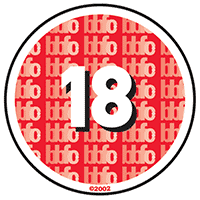 Any horror or gore in these films are allowed to be stronge, violence and language maybe frequent and detailed. However acts that breach criminal law like detailed sexualised assult are likely to be unacceptable. Stronge language and nudity are all permitted, people of the age of 18 are allowed to choose their own entertainment.
Tuesday, 6 March 2012
Question 3 What is Distribution?
1) Distribution of a film is the process of promoting the product and getting it seem by the right audiences. This will involve the production and distribution of posters and trailers which would be shown on the sides of buses and on TV for example.
 The Strangers is a horror film produced by a independent production company 'Rogue'. The poster is for-grounding the victim at the front of the shot, with the threat behind them. This is symbolising the hidden horror of the film, the characters are surrounded by black and the darkness showing that maybe there's no escape. The victims red and white clothing fits in with the colour scheme of poster, red symbolically representing blood. Her facial expression is worried and uncertain, as if she's being tormented.
This is similar to trailer, we see a shot of the masked figure in the background, showing how unaware the victim is of his presences. Furthermore, the time of day in which this happens is the night time. This creates a scarier atmosphere for the audience, there are more dark corners for threats to hide in, the whole lighting of the trailer is dull with an orange tinge. Towards he end, the shot lengths become shorter and it seems to flick back and forth, showing the panic in the characters.

The Grudge Trilogy was distributed by 'Columbia Pictures' who's parent company is 'Sony Entertainment' which is a major film production and distribution company.
The poster is different to the style of the 'The Strangers', its plainly just showing the threat of the film. The colour scheme is still the same red and black, the blackness is masking the threat, making her more mysterious.

This is similar to trailer, we see a shot of the masked figure in the background, showing how unaware the victim is of his presences. Furthermore, the time of day in which this happens is the night time. This creates a scarier atmosphere for the audience, there are more dark corners for threats to hide in, the whole lighting of the trailer is dull with an orange tinge. Towards he end, the shot lengths become shorter and it seems to flick back and forth, showing the panic in the characters.

The Grudge Trilogy was distributed by 'Columbia Pictures' who's parent company is 'Sony Entertainment' which is a major film production and distribution company.
The poster is different to the style of the 'The Strangers', its plainly just showing the threat of the film. The colour scheme is still the same red and black, the blackness is masking the threat, making her more mysterious.
Tuesday, 21 February 2012
Question 3 Production company logos
 The typeface of this text has been selected too represent wounds and blood, this would tell the audience that the production team perhaps, specialises in horror films. This is symbolised by the colour of the font being red. The background being a gothic castle portrays the classic idea of a haunting and old horrors.
The main text has been displayed in the middle of the page, which is over lapping the image in the background. This draws the audiences attention to the writing first and then the image behind. It is instantly establishing the theme of horror and definitely setting the tone for an old style horror film to follow such as 'Dracula' or 'Frankenstein'. This logo isn't very good for modern horrors.

This is image, like the other is displayed in the centre so it grabs the attention of the viewers. This logo doesn't really strike out as establishing any theme in particular, this logo is almost given as a general logo as this company obviously wouldn't just specify in one theme such as comedy or horror. But the sophistication and bold theme of this logo sets the right tone as I believe as a viewer the film to follow will be very well made and very professional.

 This logo is very striking and bold, this is because of many aspects such as the typeface. The typeface is very big, bold and square, it stands out to the audience it is almost very serious as a font. Like 'Legendary Pictures' it is quite a sophisticated and smart title. This makes the viewer instantly recognise 'Lionsgate' to be a big company and for the following feature to be very well made. Mainly the colours used are dark reds, orange and grey. The dark red could be representing that the following feature is going to be a horror as red is used for blood and evil a lot in horror films, the dark corners also suggest that the following feature may be quite dark and mysterious. The layout is simple as the title is big and bold in the middle surrounded by dark red clouds, this makes the title very iconic as almost straightaway the logo is recognisable without even properly reading the text. The logo establishes the scary horror theme and the stone coloured text suggests the realism and seriousness of the company and sets quite a mysterious tone almost making the audience wonder what the coming feature is going to be like.
 This is our film production company logo, we took inspiration from the Twister Pictures logo. This is because both production companies release the same genre of films. Twisted Pictures being famous for producing the SAW films.
The background for our logo is completely black, showing conveying a fear of unknowing and uncertainty. The name of our company is in capital letters in the same way the other posters have. The font is a smudged and distorted, which could represent desperation and disregard.
Tuesday, 7 February 2012
Question 3


These posters of previous psychological horror films all convey the same themes. The dark colours (black red and grey) seem to be surrounding and encasing the subject of the poster. The character on the poster are all vulnerable women, there facial expressions are scared and worried. This shows the audience how the film will unfold and who will be being haunted.
The composition of the image just takes up one area of the space, for example The Others poster takes up the left hand side and An American Haunting at the bottom. It could suggest that there is something perhaps sinister and unseen in the empty spaces. This has inspired our poster to use the same themes.
However, in other posters its the threat thats having attention drawn to it. The Shrooms poster for example is foregrounding the threat, whilst The Orphanage has it in the background.
Tuesday, 31 January 2012
Evaluation Question 4
The audience that we have targeted our film at would be young people, more likely female because this is the highest social group that watch psychological horrors in the cinema. Furthermore, the character with the most screen time is a white young women, she witnesses the most of the threats and therefore the audience are more likely to relate to her or put themselves in her position. The rating for this film should be a 15 because it doesn't contain themes strong enough to earn an 18 certificate.
Monday, 30 January 2012
Evaluation Question 2


The narrative of our film is a young couple just moving into a new house, they later realise that somethings wrong. There seems to be strange behaviour in the neightbour hood, and weird happening from inside the house too. This fits with the conventions of modern psychological horror films as most of them seem to be young couples being haunted because of their house of their family.
 However, due to our inabiltiy to film with the original cast, the main characters needed changing. Instead of having a young couple, we used a young girl on her own which shows how much more vunerable she is. She wears a white shirt in the film to symbolise her innocence. Because shes on her own, the audience may feel more frightened for her, as she is unpretected from the threat that's haunting her.
Evaluation Question 2
http://www.youtube.com/watch?v=_x7YNJdB1uk
This trailer of The Others represents middle class families in world war II. The mother has been left to run the house and take care of the children whilst the father is at war, and theres not promise of his returning. She also represents religous groups, as she has strong beliefs from the Bible. Shes also fits in with the stereotype of being a woman, shes unprotected from the threat in a big house.
Evaluation Question 2
http://www.youtube.com/watch?v=f7UUtLZ1Sgw&feature=player_embedded
The mother in this clip of Insidious is conforming with the social stereotypes of being a woman. She appeares to be staying at home in the day time and doing domestic chores. By being home alone she is vunerable to the threat as she is seen as a weaker than a group of men for example. She's representing young western families of today aged in her twenties, this doesnt really challenge any stereotypes in the media.
Tuesday, 17 January 2012
Question 1

This follows the normal conventions of a psychological horror, the logo of the film - which is the title - is distorted and pixeled which may symbolize visual or mental unclearness. The rest of the words on this photo like 'wrath' and 'envy' are powerful emotions that could cause a lot of emotional upset. The background of this picture seems to be rusted and dirty, showing that the surface has been ruined. All elements to this photo comply with the conventions of the sub-genre.


 This image taken from the opening titles of the film show deformed fingers, it implies to the audience that something isn't normal from the start. Broken fingers give the impression of physical violence, possibly self inflicted. The dark showing in the right corner shows that the person doing this is hidden, which creates a sense of mystery and unknowing. Furthermore, the text that the titles are displayed in looks handwritten and messy, it could make the audience feel like it's more
personal, its been directly wrote from the culprit.
This shot from the title sequence shows an old book, discarded and its pages flapping in the wind. This may cause a question as to why its been thrown out. Also this is been taken from a low angle, suggesting to the audience that this book holds power and dominance which maybe unsettling.

We can see here that our main character is slightly oblivious to the threats happening around her. She's hasn't noticed that there's a dark figure stalking her from the outside. Her top is white, which symbolises innocence and venerability in this house alone. Her facial expression shows her to be shocked and frightened.

The character in this image is holding his head, which implies that he's stressed, confused or maybe worried. It puts across the idea of a psychological horror, that the threat is something that plays games with your mind.

At this point in the film looks unsure and confused after hearing a threat. This is sticking with the conventions of a psychological horror film, as its her distressed disposition that signifies her role in this sub-genre of horror film.

This shot is to represent the Mise-en-scene in the film, it shows photograph of a woman been vandalized in a threatening way. The circles round her eyes representing the blood in which is likely to be the death of that character. The is important as the audience aren't aware of who has done it, which is likely to add to the confusion of a psychological horror.


The narrative is easy to comprehend from this shot. It shows the main character unpacking a box because she has recently moved in, and it shows the threat in the background. This shows the audience that this film is about moving into a house thats being haunted, which is a typical theme from psychological horrors of today.
This image represents the victims from the film Seven and how they have been killed by their sins. This particular characters sin appears to be gluttony, and his death looks to be related to his sin. This is how all of the victims from the film die so its a good representation of characters.
This image represents the victims from the film Seven and how they have been killed by their sins. This particular characters sin appears to be gluttony, and his death looks to be related to his sin. This is how all of the victims from the film die so its a good representation of characters.

This shot shows the character conforming to the conventions of a horror film. Although she's venerable and alone, she still goes towards the threat instead of protecting herself. I thought when making the film it was important to conform to this convention because its something an audience would look for and enjoy.

The first key image from the film is the murder scene of 'Sloth', this shows the audience that the serial killer has put the victim through a year of pain and suffering, it shows how mentally unstable and merciless he is. The sin of the victim wrote on the wall which looks to be in blood and the same font as the title sequence. This seems to be recurring in most of the murders. photo doesnt show the image of the dead body, but whats has been left behind by the killer. This is mainly blood stained white carpet leaves a memorable image in the audiences minds.
 I thought this shot was important as it shows that in the beginning, the main character has power and authority. She has the keys to her house and she enters without feeling threatened or frightened. In contrast to later on in the film, when she starts to hear noises and see strange things which make her panic.

This photo doesn't show the image of the dead body, but whats has been left behind by the killer. This is mainly blood stained white carpet leaves a memorable image in the audiences minds. The character in this shot looks confused and anxious, the way a character from a psychological horror is expected to feel here.
The main character in this shot looks alone, and isolated. This represents possibly how unable she is to look after herself. Because she's so alone, the audience may feel sympathy for her. This is why i thought this shot was important.

 This image follows the conventions of the film by having the sin written in blood on a white surface. The victim in this photo is wearing white and lying in a white bed, this symbolyses innocence and vulnerability. The colour symbolism of having red blood on a white sheet would be an image that should stick the audiences mind.
Taken from the title sequence, we see something that usually associated with happy and harmless things (the doll) as chucked out and becoming ruined. The plant and mud are covering it, showing that the most innocent things can turn dirty and ruined.
Subscribe to:
Posts (Atom)