Tuesday, 24 April 2012

Question 3; Our poster


This is the poster we have created for our film, it foregrounds the threat in the same way other posters like the one for Shrooms, has. The fonts and colour scheme coincide with what was used in the opening credits. The darkness is symbolic of the dark themes and unknowing within the film. The photo of the house is taken from a low angle, suggesting that it holds power and makes the audience feel lower in status.
 It conforms with the conventions of a horror film poster, it has star ratings and quotes from well known newspapers. The production company and age rating is also displayed clearly in the bottom corners.

Our Film Poster (Question 3)


This is our sample film poster, it follows similar conventions of other horror film posters as it shows the main threat in the image which in our the film is the house. We chose to make it black and white as many horror film posters don't have much colour in their posters to make them more intense and give a stronger feel. 

I inserted the films BBFC age certificate and inserted our production logo at the bottom (LastMinuteFilms) I also included the release date at the top to show the audience when the film will be out in the cinemas. I also included two reviews from top newspapers about the film to lure the audience in and I have seen this a lot on film posters therefore we decided to add it in to our poster. 


Release Diary:

Cinema Release: 28th March 2012

DVD Release:  20th July 2012


This is our production logo which follows certain conventions for horror production logos as the text is quite splattered and almost represents blood apart from it not being red. We decided to make it more of a dirty brown colour because red is very commonly used in production logos. We also used a black background to allow it to stand out as it would be crowded with a detailed background.


This is 'Twisted Pictures' logo who play with the name of their company within the logo by making what is almost barbed wire twisted around the text and use the big spike in the middle to separate the two words. This keeps it very simple and down to earth, the black background helps the logo stand out much more as it wouldn't stand out very well with a coloured background.


Here 'Lionsgate' use a very dark, striking, horror looking red. The typeface is very big, bold and square, it stands out to the audience it is almost very serious as a font. The layout is simple as the title is big and bold in the middle surrounded by dark red clouds, this makes the title very iconic as almost straightaway the logo is recognisable without even properly reading the text. The logo establishes the scary horror theme and the stone coloured text suggests the realism and seriousness of the company and sets quite a mysterious tone


Question 5; Attracting the audience

 The Others (12)

The Others is rated a 12, this is probably because the themes of the film only contain mild horror. There are no scenes of strong violence or nudity, which would normally increase the rating. This film is a thriller, it does not contain any frightening images. The horror is stemmed from the build up, background music and lighting which creates a sense of unknowing.

 Paranormal Activity (15)

Paranormal Activity contains stronger themes of haunting. This shows scenes of  actual horror, for example possession, poltergeist activity and intense levels of distress of the victims. However, it does not have any sexual content or scene of violence or mutilation, therefore it doesn't have and 18 age rating.

 The Grudge (15)

The Grudge is a film based on the idea of a ghost seeking revenge. The film shows the threat to be of a sinister appearance, stalking its victims which could be seen as frightening. Through out the film we do not see the victims dyeing in a way that displays high levels of gore. There are also no sexual themes and nudity within this film.

SAW (18)

The SAW films however contain, themes of stalking, high levels of gore, violence, torture, suffering and nudity. Therefore this film is deemed to be an 18. The main plot is for victims to free themselves from death by torturing themselves, here we see scenes of people cutting off there own body parts, burning and stabbing themselves. 


Hostel (18)

Hostel is a film that consolidates all the themes of an 18 rated film. Within the film, scenes of torture and torment, sex and nudity and the threat is displayed in a frightening way. The main idea is to mutilate people to harbor their body parts.


Guidelines and Classifications from BBFC

www.bbfc.co.uk/classification/guidelines

Any horror that is in this certificate is allowed as long as the themes are moderate and its infrequent throughout the film. Other guidelines that the film has to follow include minor details in violence and sexual themes, not glamourising the use of drugs or giving instructional detail and explicit langauge must be rare and infrequent.


The horror content in a film thats been rated a 15 is allowed to have a stronge menacing threat,as long as this is not sexualised or sadistic in anyway. Drug use is allowed to be shown but shouldn't be promoted, stronge gorey images are not allowed but the use of frequent strong language is acceptable.
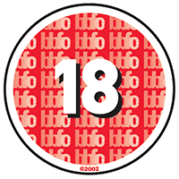
Any horror or gore in these films are allowed to be stronge, violence and language maybe frequent and detailed. However acts that breach criminal law like detailed sexualised assult are likely to be unacceptable. Stronge language and nudity are all permitted, people of the age of 18 are allowed to choose their own entertainment.

Tuesday, 27 March 2012

Final Film

Tuesday, 6 March 2012

What kind of media institution might distribute your media product and why?

In marketing, distribution is the process of moving a product from its manufacturing source to its customers. In film, distribution is the phase after packaging. The package will be on some distribution medium such as a DVD or may be simply located on a server where customers can download it electronically. Distribution is also the process of getting your film seen, promoting your film using advertising such as posters and trailers. 


We might distribute our film in ways such as posters and trailers using examples for inspiration:

This film is distributed by Dimension Films who have a parent company who are Walt Disney; a major distributor. This poster is quite striking as it shows the typical 'Scream' mask which is commonly known for many film fans to show the film is 'Scream'. The mask blends into a blade which shows the film is quite evil and obviously a slasher. Colours are mainly black, white and red which are commonly known as quite common colours for horror films. The text is very basic and bold and makes it clear, they also changed the A in 'Scream' for a 4 to show it's the 4th film. 

The trailer also fits in with the theme of the poster, the titles are blacks, greys and reds and also in the same text style of what is used in the poster. There is dramatic horror tension building music throughout the trailer and jump scenes. It draws in the viewer using things such as tension building music and smooth dark titles. Also the trailer goes from quite slow clips to very fast paced clips. This keeps the viewer entertained so they do not get bored watching the trailer, the trailer finishes with everything going fast paced and the main threat is shown many times. It is topped off with the title 'SCRE4M' in the same style as it is on the posters fading into the distance. 


This poster for 'Shrooms' was distributed by Vertigo Films who are an independent UK film company. The poster is quite similar to the scream poster as it uses black and white with hints of green/blue, but mainly it has almost a skull face in the moon similar to the mask face on scream's poster. The text is a lot more basic in this poster and is almost blurred white lines coming from the text. This poster actually includes more of a background unlike 'Scream' which just had a black background with the threat. The titles and text work around this picture and the layout works really well. Although given that it is distributed by an independent film company the poster doesn't look somewhat as professional as the 'Scream' poster which was distributed by a major media institution. 

This trailer is very well done and keeps the viewer watching, it is a slow start with long length shots and as the trailer goes on and the music gets more intense the clips begin to shorten and more events happen in them. The fonts used are the same that are used for the title 'Shrooms' yet at the end of the trailer isn't the same font as used in the poster. Colours used in the title are greys and whites such as in the poster again, at the end of the trailer the clips get very jumpy with scenes of the threat. 

Question 3 What is Distribution?

1) Distribution of a film is the process of promoting the product and getting it seem by the right audiences. This will involve the production and distribution of posters and trailers which would be shown on the sides of buses and on TV for example.


The Strangers is a horror film produced by a independent production company 'Rogue'. The poster is for-grounding the victim at the front of the shot, with the threat behind them. This is symbolising the hidden horror of the film, the characters are surrounded by black and the darkness showing that maybe there's no escape. The victims red and white clothing fits in with the colour scheme of poster, red symbolically representing blood. Her facial expression is worried and uncertain, as if she's being tormented.
This is similar to trailer, we see a shot of the masked figure in the background, showing how unaware the victim is of his presences. Furthermore, the time of day in which this happens is the night time. This creates a scarier atmosphere for the audience, there are more dark corners for threats to hide in, the whole lighting of the trailer is dull with an orange tinge. Towards he end, the shot lengths become shorter and it seems to flick back and forth, showing the panic in the characters.


The Grudge Trilogy was distributed by 'Columbia Pictures' who's parent company is 'Sony Entertainment' which is a major film production and distribution company.
The poster is different to the style of the 'The Strangers', its plainly just showing the threat of the film. The colour scheme is still the same red and black, the blackness is masking the threat, making her more mysterious.

Tuesday, 21 February 2012

Question 3 Production company logos

 The typeface of this text has been selected too represent wounds and blood, this would tell the audience that the production team perhaps, specialises in horror films. This is symbolised by the colour of the font being red. The background being a gothic castle portrays the classic idea of a haunting and old horrors.
The main text has been displayed in the middle of the page, which is over lapping the image in the background. This draws the audiences attention to the writing first and then the image behind. It is instantly establishing the theme of horror and definitely setting the tone for an old style horror film to follow such as 'Dracula' or 'Frankenstein'. This logo isn't very good for modern horrors.


 This logo is very simplistic and almost sophisticated. The font being in a formal golden font imply to the audience that the film has been made by a high-end production company. The black background with the simple writing and logo be easily memorable. The complex golden shape above the text is very iconic and would be recognisable to many audiences as 'Legendary Pictures' because of the logo above.
This is image, like the other is displayed in the centre so it grabs the attention of the viewers. This logo doesn't really strike out as establishing any theme in particular, this logo is almost given as a general logo as this company obviously wouldn't just specify in one theme such as comedy or horror. But the sophistication and bold theme of this logo sets the right tone as I believe as a viewer the film to follow will be very well made and very professional.


This logo is very striking and appealing to the viewer. The typeface used is quite regular and casual but not perfectly proportioned or all equal height unlike the above photo, colour used is quite regular grey and almost brown for the barbed wire wrapping the text. This keeps it very simple and down to earth, the black background helps the logo stand out much more as it wouldn't stand out very well with a coloured background. The spike in the middle is very iconic as it very big and eye catching for the audience, the way the barbed wire is wrapped and twisted around the title fits with the actual name of the title 'Twisted Pictures'. Composition is used very well as the barbed wire and spike are both placed very well and instantly stand out and becoming instantly recognisable as 'Twisted Pictures'. The theme of this logo instantly lets the viewer know that the coming feature is most definitely going to be a horror film and brings quite a dark, eerie mood to the viewer.


This logo is very striking and bold, this is because of many aspects such as the typeface. The typeface is very big, bold and square, it stands out to the audience it is almost very serious as a font. Like 'Legendary Pictures' it is quite a sophisticated and smart title. This makes the viewer instantly recognise 'Lionsgate' to be a big company and for the following feature to be very well made. Mainly the colours used are dark reds, orange and grey. The dark red could be representing that the following feature is going to be a horror as red is used for blood and evil a lot in horror films, the dark corners also suggest that the following feature may be quite dark and mysterious. The layout is simple as the title is big and bold in the middle surrounded by dark red clouds, this makes the title very iconic as almost straightaway the logo is recognisable without even properly reading the text. The logo establishes the scary horror theme and the stone coloured text suggests the realism and seriousness of the company and sets quite a mysterious tone almost making the audience wonder what the coming feature is going to be like.

This is our film production company logo, we took inspiration from the Twister Pictures logo. This is because both production companies release the same genre of films. Twisted Pictures being famous for producing the SAW films.
The background for our logo is completely black, showing conveying a fear of unknowing and uncertainty. The name of our company is in capital letters in the same way the other posters have. The font is a smudged and distorted, which could represent desperation and disregard.